DESIGN PRESENTATION

FONTSENSE

一款为设计师打造的字体识别、科普与推荐工具 A font recognition, knowledge & recommendation tool for designers

SWISS INTERNATIONAL STYLE AKZIDENZ GROTESK VISUAL COMMUNICATION
QUESTION 01

"这是什么字体?" "What font is this?"

你有没有这样的经历?看到一件设计作品,风格和字体如此搭配——
你想从中学习,却不知道用的是什么字体。

Have you ever seen a design with perfect typography — wanting to learn from it, but unable to identify the font?

A1
THE PAIN POINT

不只是名字
更需要知识
NOT JUST A NAME,
BUT KNOWLEDGE

不仅仅是字体的外观,一款字体诞生的时间、地点、背后的历史代表着这款字体的立场与内涵,这些信息帮助设计师做出更好的设计决策。

A typeface carries more than its appearance — its origin, history, and cultural context embody its identity and meaning, helping designers make informed decisions.

然而现有的字体识别工具只告诉你「这是什么」,却不告诉你「它代表什么」。设计师需要的是完整的字体知识

Yet existing font identification tools only tell you what it is, not what it stands for. Designers need complete typographic knowledge.

"字体不只是形状——
它是文化、历史、
和设计立场的载体。"
"A typeface is not just a shape —
it carries culture, history,
and a design position."
QUESTION 02

为什么要做
FontSense
Why build
FontSense?

是什么驱动我们做这个工具? What motivated us to build this tool?

A2
OUR ANSWER

不只是识别
更是理解
NOT JUST RECOGNITION,
BUT UNDERSTANDING

我们的目标是构建一个三合一的字体工具——从「看到」到「理解」到「选对」的完整闭环,帮助设计师用知识而不只是直觉来做决定。

Our goal is to build a three-in-one font tool — a complete loop from "seeing" to "understanding" to "choosing right", helping designers decide with knowledge, not just intuition.

01 — IDENTIFY

上传图片,AI 视觉模型自动识别字体。解决「这是什么字体」的第一步。

Upload an image and let AI vision models identify the typeface. The first step to answering "what font is this?"

02 — KNOWLEDGE

不止于名字——字体的历史、精神、适用场景、情绪标签、配对建议。补齐背后的知识。

Beyond a name — history, spirit, use cases, mood tags, and pairing suggestions. Completing the knowledge behind the font.

03 — RECOMMEND

描述你的项目,系统智能匹配最合适的字体。从识别到推荐,完整闭环。

Describe your project, and the system intelligently matches the best typefaces. From identification to recommendation — a complete loop.

QUESTION 03

为什么选择
瑞士国际主义
风格?
Why the
Swiss International
Typographic Style?

这种设计风格为何与 FontSense 完美契合? Why is this design philosophy a perfect fit for FontSense?

A3
DESIGN PHILOSOPHY

SWISS
INTERNATIONAL
STYLE

瑞士国际主义风格诞生于 1950 年代,是现代平面设计的基石。它强调:

Born in the 1950s, the Swiss International Typographic Style is a cornerstone of modern graphic design. It emphasizes:

  • 客观性与理性 — 设计应服务于内容,而非设计师的自我表达
  • 网格系统 — 数学化的布局带来秩序与清晰
  • 无衬线字体 — Akzidenz Grotesk、Helvetica 作为客观传达的工具
  • 留白即呼吸 — 空间本身就是设计元素
  • 极简配色 — 黑白为主,少量强调色承载功能性
  • 信息层级 — 通过字重、字号、间距建立清晰的视觉层次
  • Objectivity & Rationality — Design serves content, not the designer's ego
  • Grid Systems — Mathematical layouts bring order and clarity
  • Sans-serif Typography — Akzidenz Grotesk, Helvetica as tools for objective communication
  • Whitespace as Breath — Space itself is a design element
  • Minimal Color — Black and white dominant, accent color carries function
  • Information Hierarchy — Weight, size, and spacing create clear visual layers
A3
WHY IT MATTERS FOR DESIGNERS

瑞士风格对设计师的重要性 THE IMPORTANCE OF SWISS STYLE FOR DESIGNERS

瑞士国际主义不仅仅是一种视觉风格——它是一套设计方法论。学习瑞士风格意味着理解设计的本质:以用户为中心,以内容为导向,以秩序为骨架

Swiss International Style is more than an aesthetic — it is a design methodology. Learning it means understanding the essence of design: user-centered, content-driven, structured by order.

"The grid system is an aid, not a guarantee. It permits a number of possible uses and each designer can look for a solution appropriate to his personal style."
— JOSEF MÜLLER-BROCKMANN, 1981

我们选择瑞士风格,因为它与产品理念完美契合:工具应当透明、高效、不喧宾夺主。当设计师使用 FontSense 时,界面不应该成为干扰,而是安静地服务于核心目标。

We chose Swiss Style because it aligns perfectly with our product philosophy: a tool should be transparent, efficient, and never overshadow the work. The interface serves the designer, quietly.

正如瑞士设计所倡导的——好的设计是看不见的设计

As Swiss design advocates — good design is invisible design.

QUESTION 04

为什么选择
Akzidenz Grotesk
作为英文字体?
Why choose
Akzidenz Grotesk
as our typeface?

这个字体选择代表了什么? What does this typeface choice represent?

A4
OUR ANSWER

AKZIDENZ
GROTESK

FOUNDRY H. Berthold AG
YEAR 1898
CLASSIFICATION Grotesque Sans-Serif
SIGNIFICANCE Helvetica's predecessor

Akzidenz Grotesk 诞生于 1898 年,是瑞士国际主义运动的「原点字体」——比 Helvetica 早了近 60 年。选择 AG 而非 Helvetica,代表着对字体历史的深度了解,代表着一种专业态度与设计自觉

Born in 1898, Akzidenz Grotesk is the "origin typeface" of the Swiss movement — predating Helvetica by nearly 60 years. Choosing AG over Helvetica signals a deep knowledge of typographic history, a professional identity and design consciousness.

这与 FontSense 的初心完全一致:我们做的不只是表面的识别,而是帮助设计师深入字体背后的知识——真正了解字体,才能做出好设计

This aligns perfectly with FontSense's mission: we go beyond surface-level identification to help designers understand the story behind the typetruly knowing a typeface leads to better design.

Aa Bb Cc Dd
Ee Ff Gg Hh
QUESTION 05

项目设计思维过程 Project Design Thinking Process

我们如何从痛点走向解决方案? How did we go from pain points to solutions?

A5
OUR ANSWER

设计思维过程 DESIGN THINKING PROCESS

01 EMPATHIZE

共情EMPATHIZE

作为设计师,我们深知「看到好字体却不知道是什么」的痛点。市面工具只给名字,不给知识。

As designers, we know the pain of seeing great typography without knowing what it is. Existing tools give names, not knowledge.

02 DEFINE

定义DEFINE

设计师需要的不只是字体名称,而是完整的字体「知识档案」——历史、精神、适用场景。

Designers need more than a font name — they need a complete "knowledge profile": history, spirit, and usage contexts.

03 IDEATE

构思IDEATE

三合一工具:识别 + 百科 + 推荐。用瑞士风格传达专业感与信任感。

Three-in-one tool: Identify + Encyclopedia + Recommend. Swiss Style conveys professionalism and trust.

04 PROTOTYPE

原型PROTOTYPE

单页应用,三个 Tab 无缝切换。5:7 网格系统,零圆角,黑白红三色设计系统。

Single-page app with three seamless tabs. 5:7 grid system, zero border-radius, black-white-red design system.

05 TEST

测试TEST

验证三个核心流程:上传→识别→知识卡、搜索→百科、描述→推荐。

Validated three core flows: Upload→Identify→Knowledge Card, Search→Encyclopedia, Describe→Recommend.

FEATURE 01

UPLOAD &
IDENTIFY

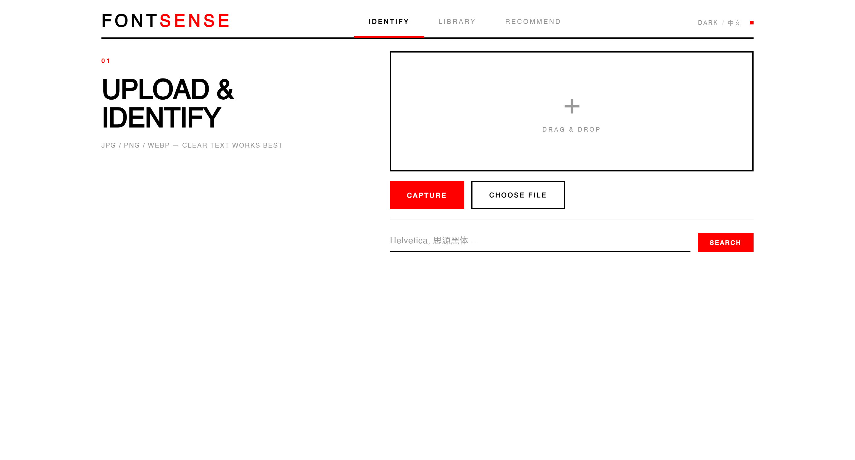
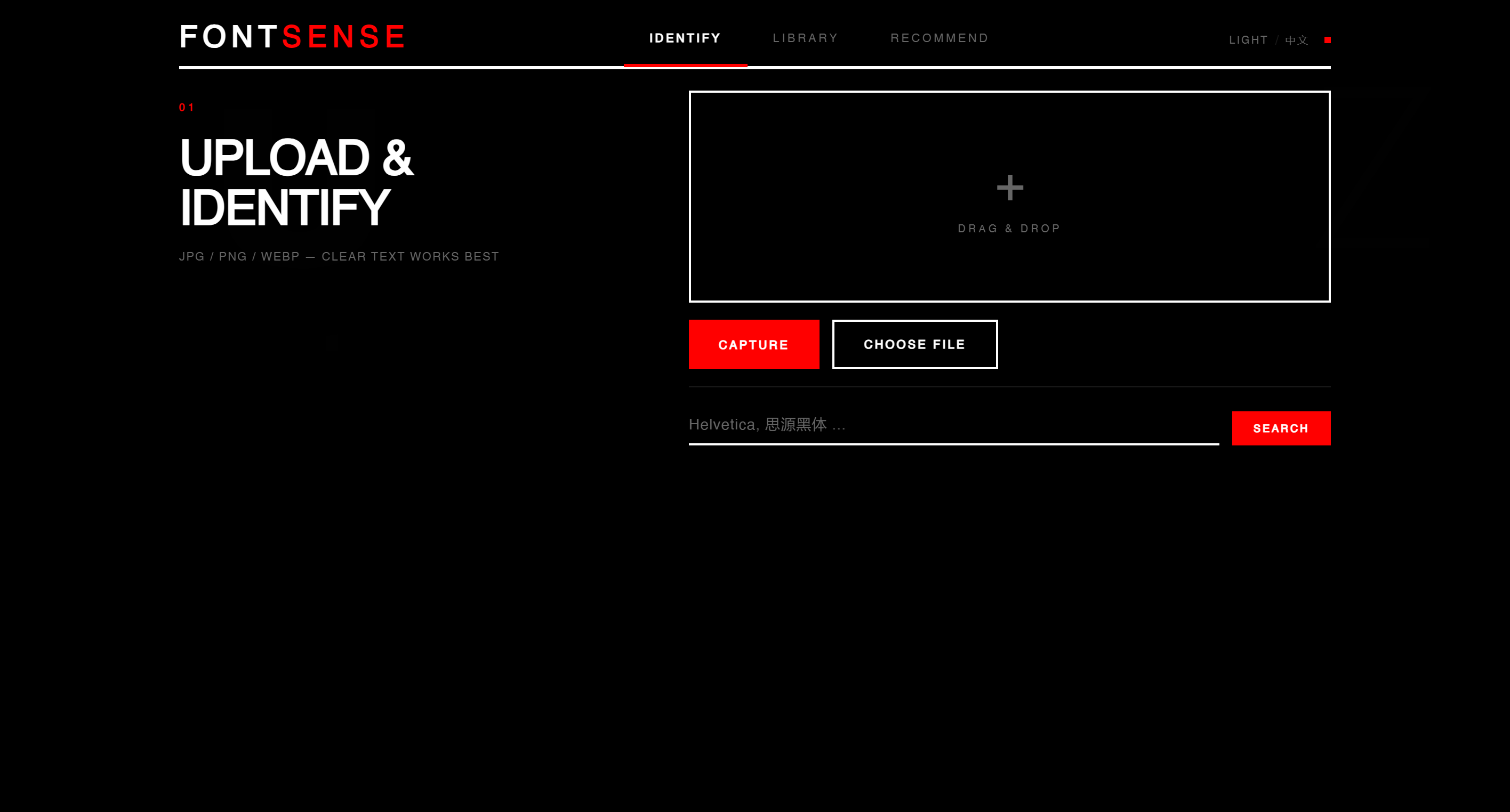
拖放、选择文件或实时拍照——三种方式上传图片。AI 视觉模型自动分析字体特征,返回候选列表。

Drag-and-drop, file picker, or live camera — three ways to upload images. AI vision models analyze font features and return candidate lists.

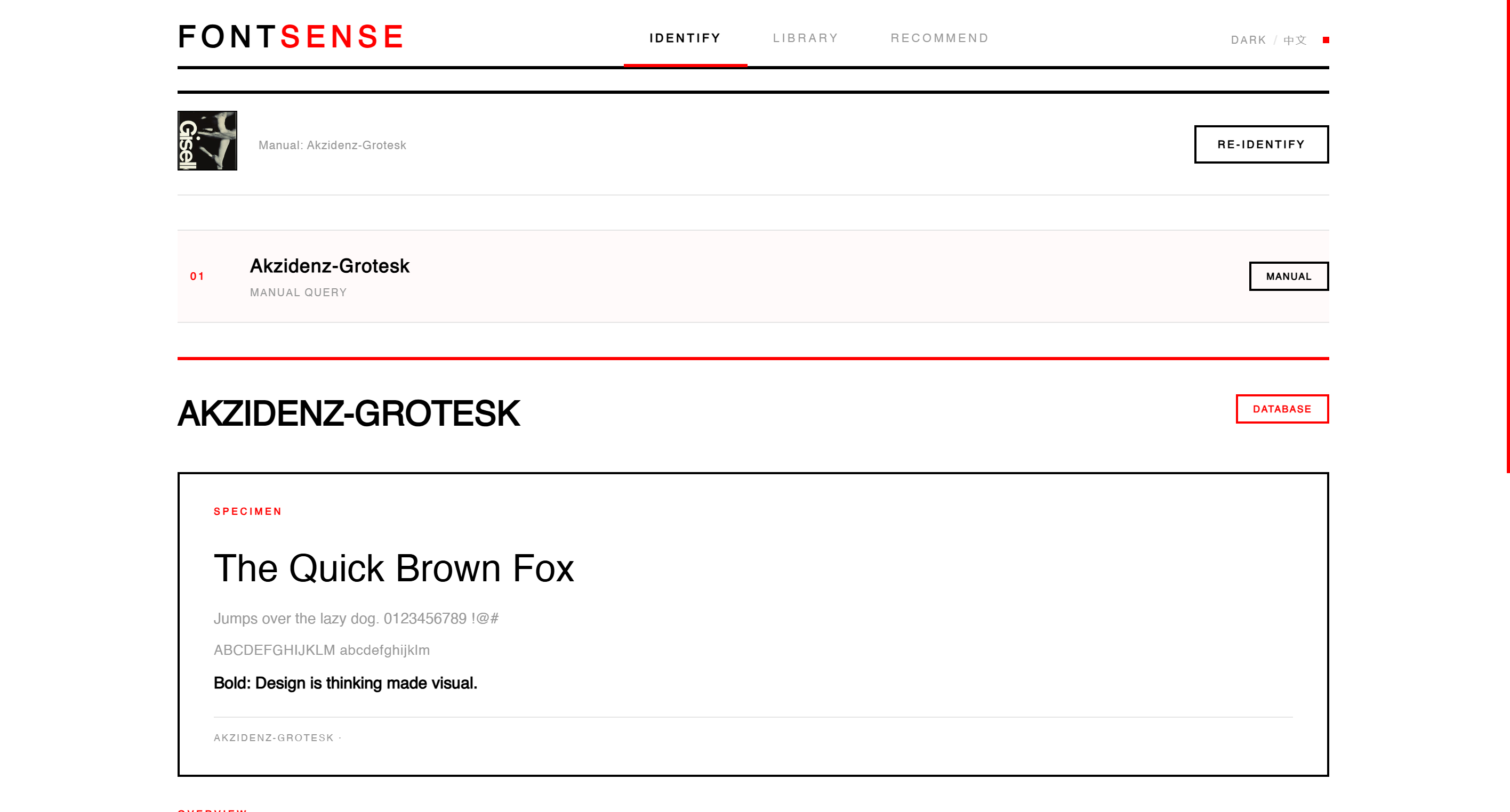
选择任意候选字体,立即生成完整的知识卡片——包含历史概述、设计精神、情绪标签、适用场景、配对建议。

Select any candidate to instantly generate a complete knowledge card — including historical overview, design spirit, mood tags, use cases, and pairing suggestions.

AI VISION DRAG & DROP CAMERA KNOWLEDGE CARD
Identify page
DEMO
LIVE DEMONSTRATION

实际使用演示 LIVE DEMO

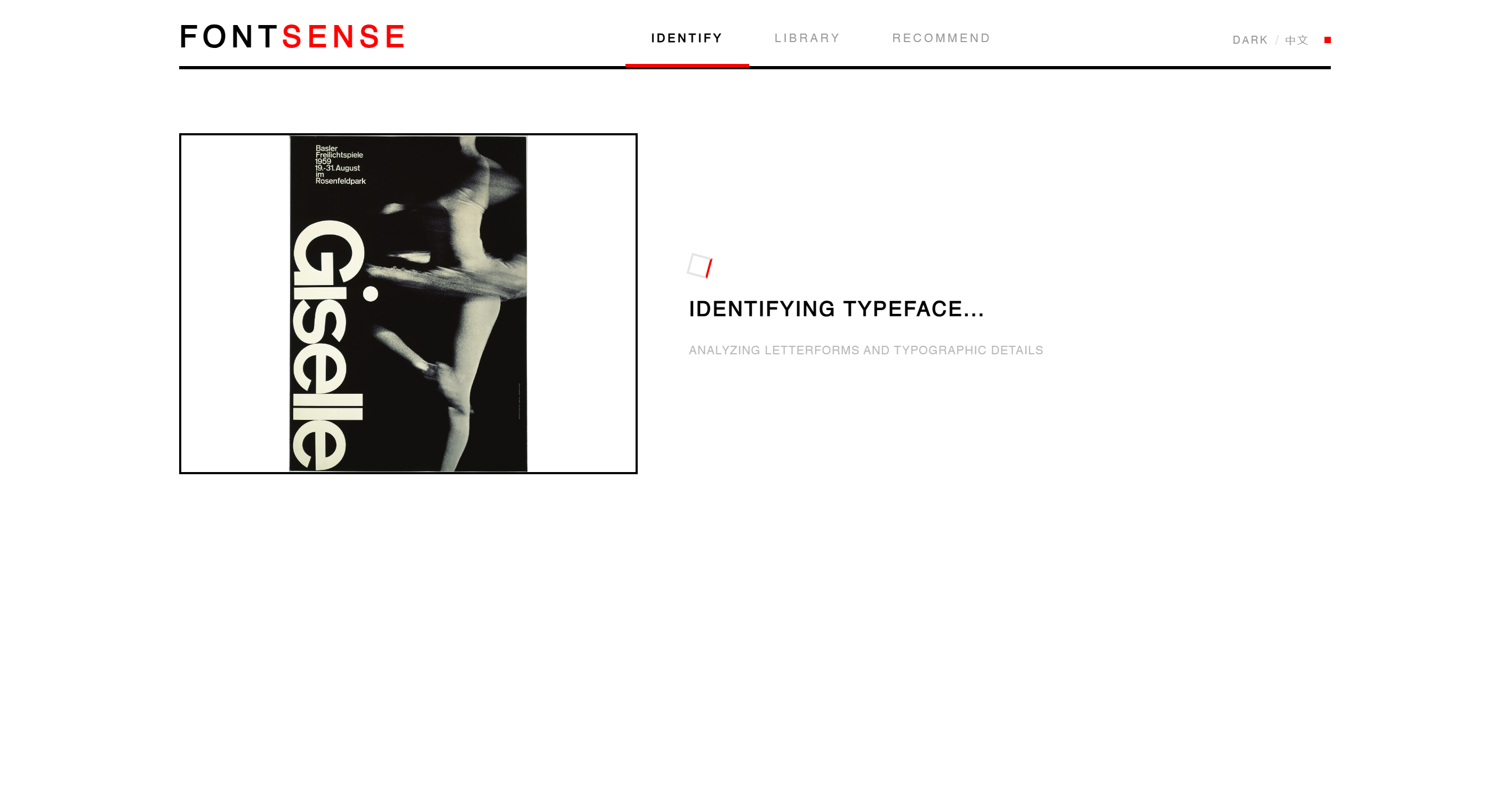
以 Armin Hofmann 的经典瑞士海报《Giselle》(1959) 为例,展示 FontSense 的完整使用流程——

Using Armin Hofmann's classic Swiss poster "Giselle" (1959) to demonstrate the complete FontSense workflow —

Recognizing
STEP 1 — UPLOAD & IDENTIFY
Knowledge
STEP 2 — RESULT & SPECIMEN
Knowledge detail
STEP 3 — KNOWLEDGE CARD
FEATURE 02

FONT
LIBRARY

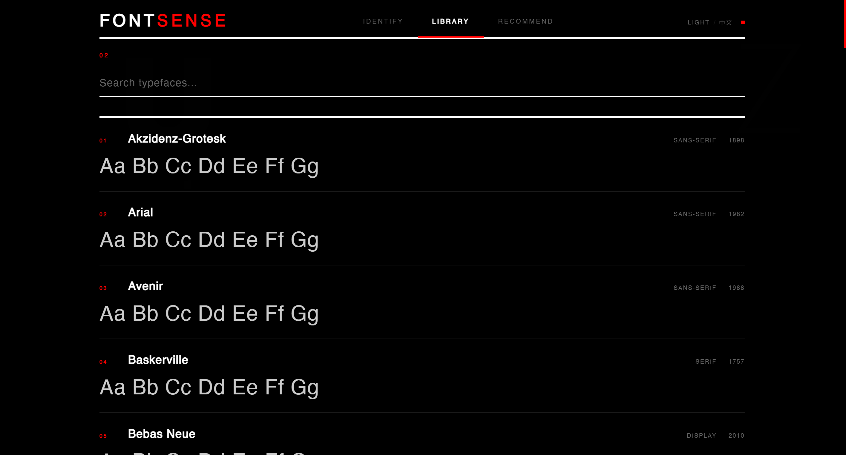
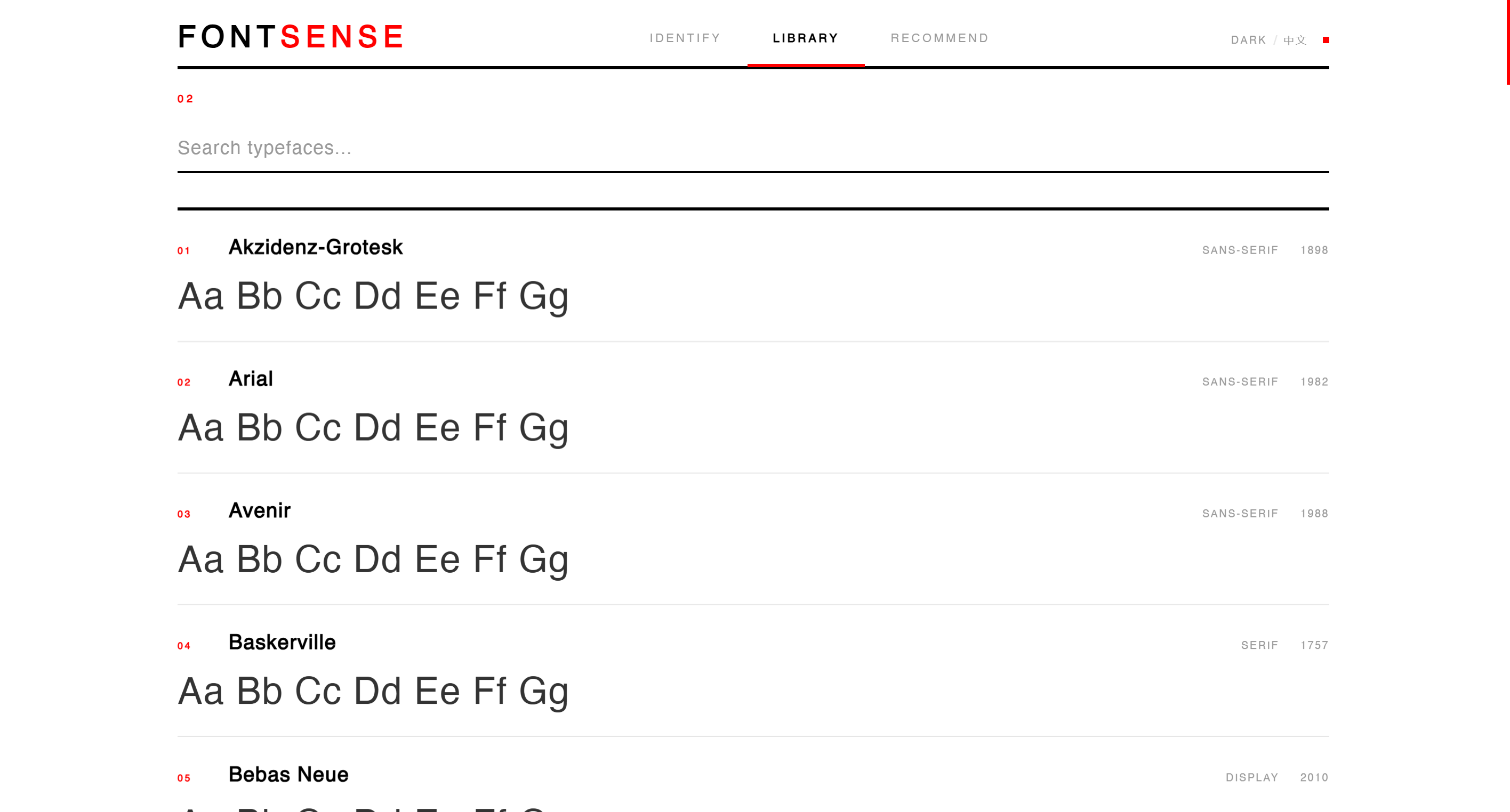
瑞士编目式字体百科。每款字体都有编号、分类、年份和实时试排预览。

A Swiss-catalogued font encyclopedia. Every typeface has a number, classification, year, and live specimen preview.

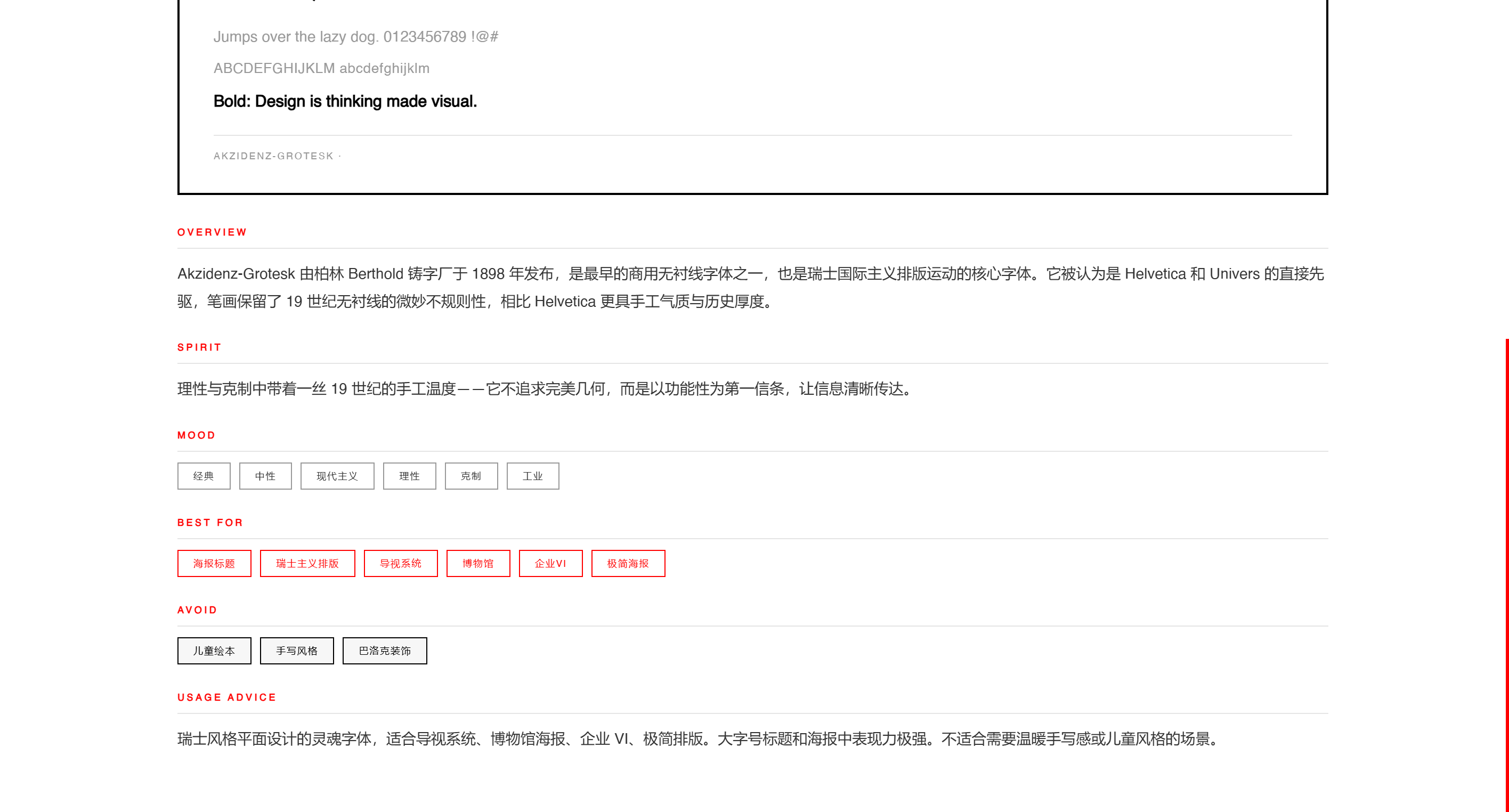
点击任意字体,打开详细知识卡片——OVERVIEW、SPIRIT、MOOD、BEST FOR、AVOID、PAIRING。这不是字体列表,而是字体教科书

Click any typeface to open its detailed knowledge card — OVERVIEW, SPIRIT, MOOD, BEST FOR, AVOID, PAIRING. This is not a font list, it's a font textbook.

ENCYCLOPEDIA GSAP ANIMATION LIVE SPECIMEN
Library page
FEATURE 03

SMART
RECOMMEND

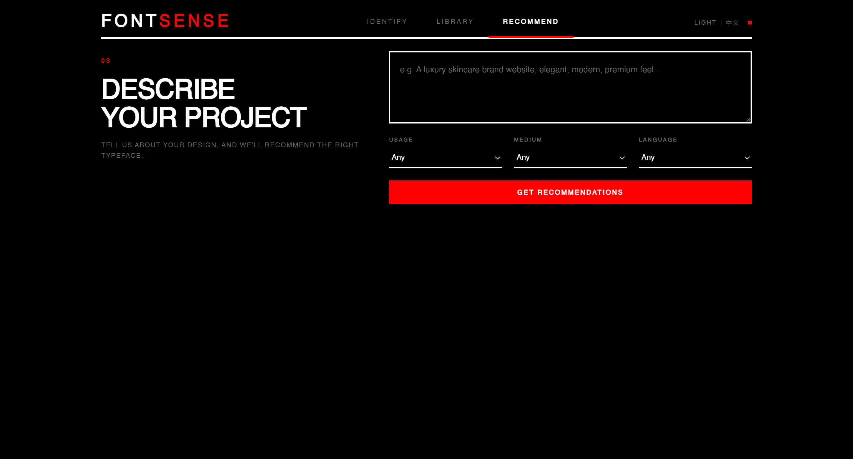
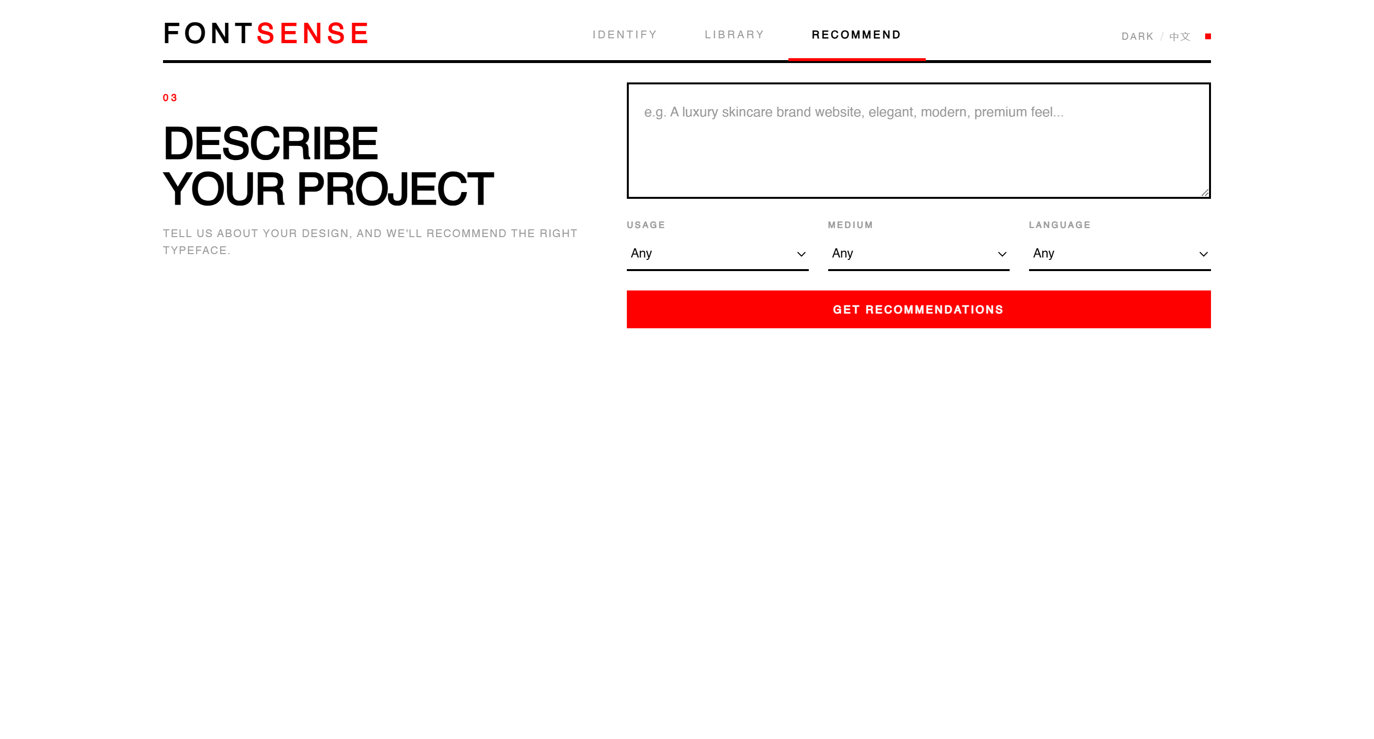
描述你的项目——品牌调性、应用场景、目标媒介——系统智能分析并推荐最匹配的字体。

Describe your project — brand tone, use case, target medium — and the system intelligently recommends the best-matching typefaces.

每个推荐都附带匹配度评分、推荐理由和标签。点击即可跳转到知识卡片,形成从「看到」到「理解」到「选对」的完整闭环

Each recommendation includes a match score, rationale, and tags. Click to jump to the knowledge card, forming a complete loop from seeing to understanding to choosing.

AI MATCHING MATCH SCORE CROSS-LINK
Recommend page
QUESTION 06

关键 UI/UX
设计决策与理由
Key UI/UX Design
Decisions and
Their Rationale

我们做了哪些关键决策,以及为什么? What key decisions did we make, and why?

A6
OUR ANSWER

关键 UI/UX 设计决策 KEY UI/UX DESIGN DECISIONS

ZERO BORDER-RADIUS

所有按钮、输入框、卡片均为直角——理性、精确、不妥协

All buttons, inputs, and cards use sharp corners — rational, precise, uncompromising.

5:7 GRID SYSTEM

左侧标题(5 份)+ 右侧操作(7 份),遵循 F 型阅读模式。

Left title (5 parts) + right action (7 parts), following the F-pattern reading model.

BLACK · WHITE · RED

每种颜色都有明确的功能含义,不做装饰性使用。

Each color has a clear functional meaning — never decorative.

NUMBERED SECTIONS

红色编号(01/02/03)让用户感知秩序感与专业感

Red numbering (01/02/03) conveys order and professionalism.

UNDERLINE INPUTS

最小化视觉噪音,聚焦时变红提供明确反馈。

Minimal visual noise — turns red on focus for clear feedback.

HOVER = INDENT

仅通过 12px 位移暗示可交互性——微妙但有效

A 12px indent hints interactivity — subtle yet effective.

DESIGN DECISIONS IN ACTION
Identify Knowledge
A6
DUAL THEME SYSTEM

LIGHT & DARK

完整的亮/暗双主题——通过 CSS 变量实现无缝切换。设计师经常在暗色环境中工作,暗色模式不是附加功能,而是对用户工作习惯的尊重

Full light/dark dual themes — seamless switching via CSS variables. Designers often work in dark environments; dark mode is not an add-on, but respect for users' work habits.

Light mode
LIGHT MODE — IDENTIFY
Dark mode
DARK MODE — IDENTIFY
A6
DESIGN SYSTEM

视觉设计系统 VISUAL DESIGN SYSTEM

COLOR PALETTE

#000000
Primary
#FFFFFF
Background
#FF0000
Accent / CTA
#999999
Secondary text
#E5E5E5
Borders

TYPOGRAPHY

ENGLISH — AKZIDENZ GROTESK
Aa Bb Cc Dd Ee Ff
CHINESE — NOTO SANS SC
永远热爱 生活设计
COMPONENTS
ACCENT BTN OUTLINE BTN TAG
Input field (underline style)
QUESTION 07

它如何在视觉传达
设计过程中使用?
How is it used in
Visual Communication
Design?

FontSense 在实际设计工作中的应用场景 Real-world application scenarios for FontSense

A7
OUR ANSWER

在视觉传达设计中的应用 APPLICATIONS IN VISUAL COMMUNICATION

BRANDING

识别竞品或灵感来源中的字体,了解其历史内涵,确保品牌用字与定位一致。

Identify fonts from competitors or inspiration sources, understand their heritage, and ensure brand typography aligns with positioning.

POSTER / EXHIBITION

快速识别参考作品中的字体,获取配对建议,加速排版决策过程。

Quickly identify fonts in reference works, get pairing suggestions, and accelerate typographic decisions.

UI/UX INTERFACE

输入项目描述(如「科技感后台管理系统」),获取适合屏幕阅读的字体推荐。

Enter a project description (e.g., "tech-forward admin dashboard") to get screen-optimized font recommendations.

EDUCATION

字体知识卡片可作为教学辅助工具,帮助学生建立对经典字体的系统认知。

Font knowledge cards serve as teaching aids, helping students build systematic understanding of classic typefaces.

EDITORIAL

通过字体情绪标签和适用场景分析,为不同类型的出版物选择最合适的排印方案。

Use mood tags and context analysis to select the best typographic scheme for different publications.

MULTILINGUAL

中英双语支持,帮助处理中英混排设计中的字体选择与配对问题。

Bilingual support helps handle font selection and pairing challenges in Chinese-English mixed typesetting.

DEVELOPMENT OVERVIEW

技术架构 TECHNICAL ARCHITECTURE

简要介绍开发实现——

A brief overview of the development stack —

  • Frontend — Vanilla HTML/CSS/JS + GSAP
  • Backend — Python FastAPI + Uvicorn
  • AI Vision — Multi-platform API (DashScope / Zhipu / OpenAI)
  • Database — SQLite + JSON seed data
  • Recommender — Keyword tag matching algorithm
  • i18n — Bilingual dictionary system
Library dark
LIBRARY — DARK
Recommend dark
RECOMMEND — DARK
THANK YOU

FONTSENSE

"真正了解字体,才能做出好设计。"
"Truly knowing a typeface leads to better design."

识别 · 科普 · 推荐 — 为设计师打造的字体工具 Identify · Learn · Recommend — A font tool for designers

SWISS STYLE AKZIDENZ GROTESK FONTSENSE.DESIGN
01 / 24